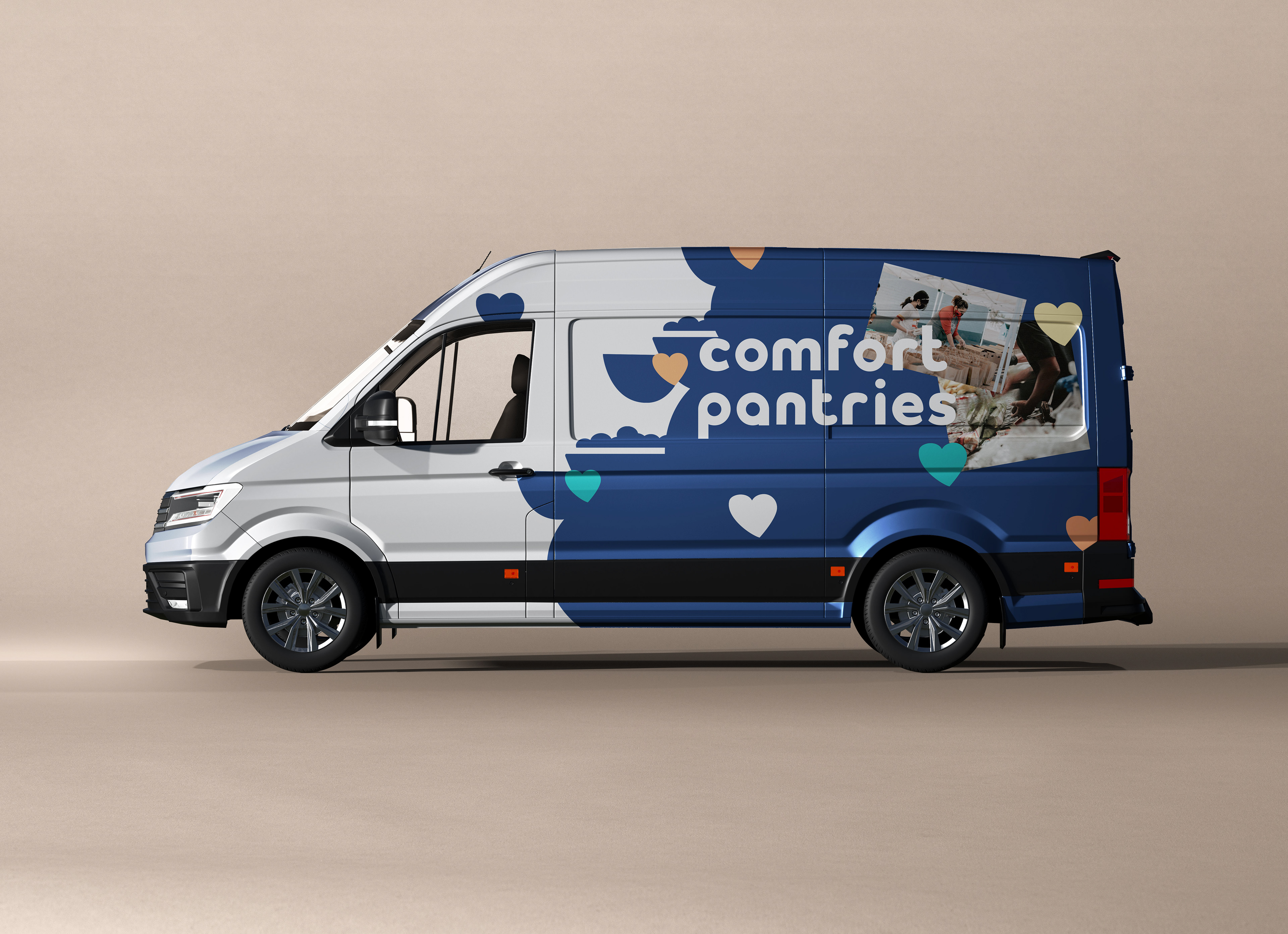
Comfort Pantries
'22 Student Project
case study
User Experience, Web Design, Brand Identity
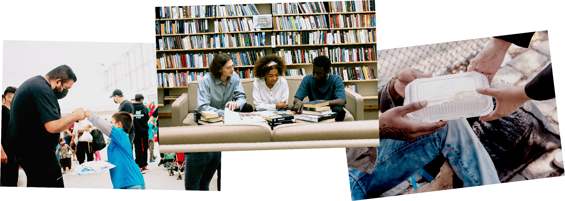
Mobile food pantry who caters to college students, homeless, and local residents.
background
There were times when it was difficult for me to simply acquire a meal while I was studying in Chicago. However, living in the city made me realize that there are individuals in far more dire situations than what I was facing.
As designers and/or creatives, we are encouraged to use our voices, which, I guess, is to create something that will have a positive influence. So for my school project, I took the chance to seek out how I could promote opportunities and knowledge about food insecurity within my community.
Challenge
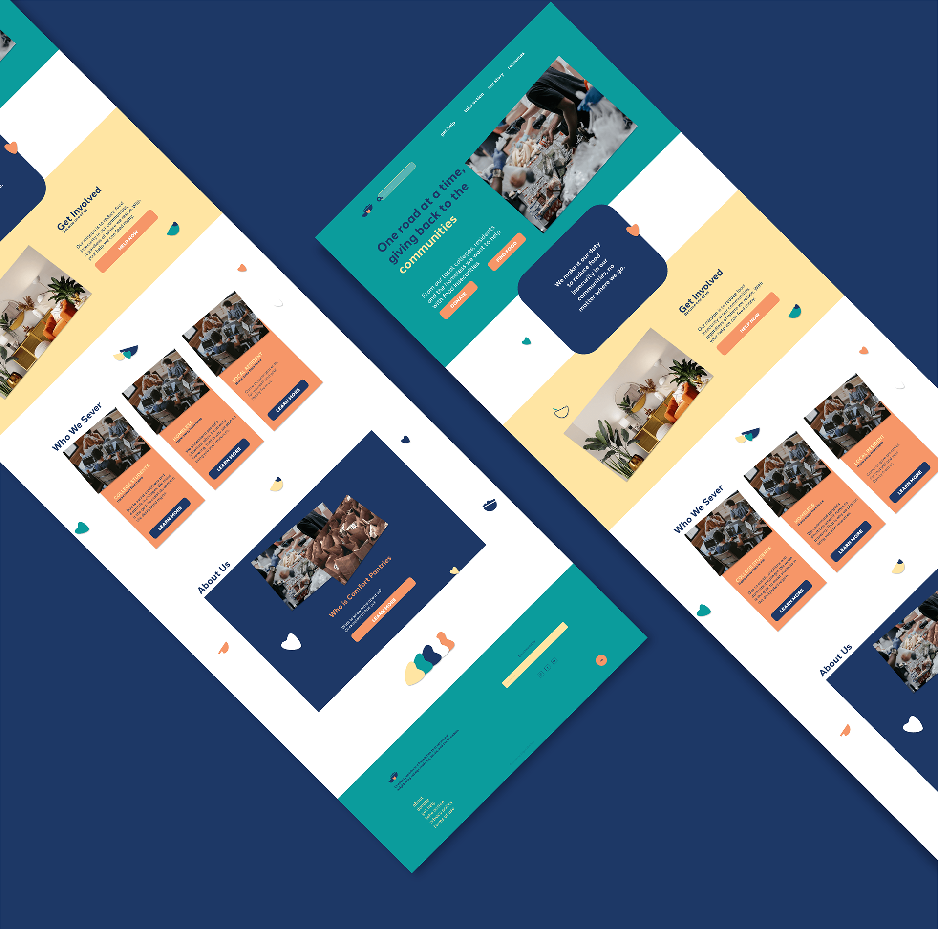
Create/design a responsive website and brand for people seeking food information and volunteer opportunities from any device.
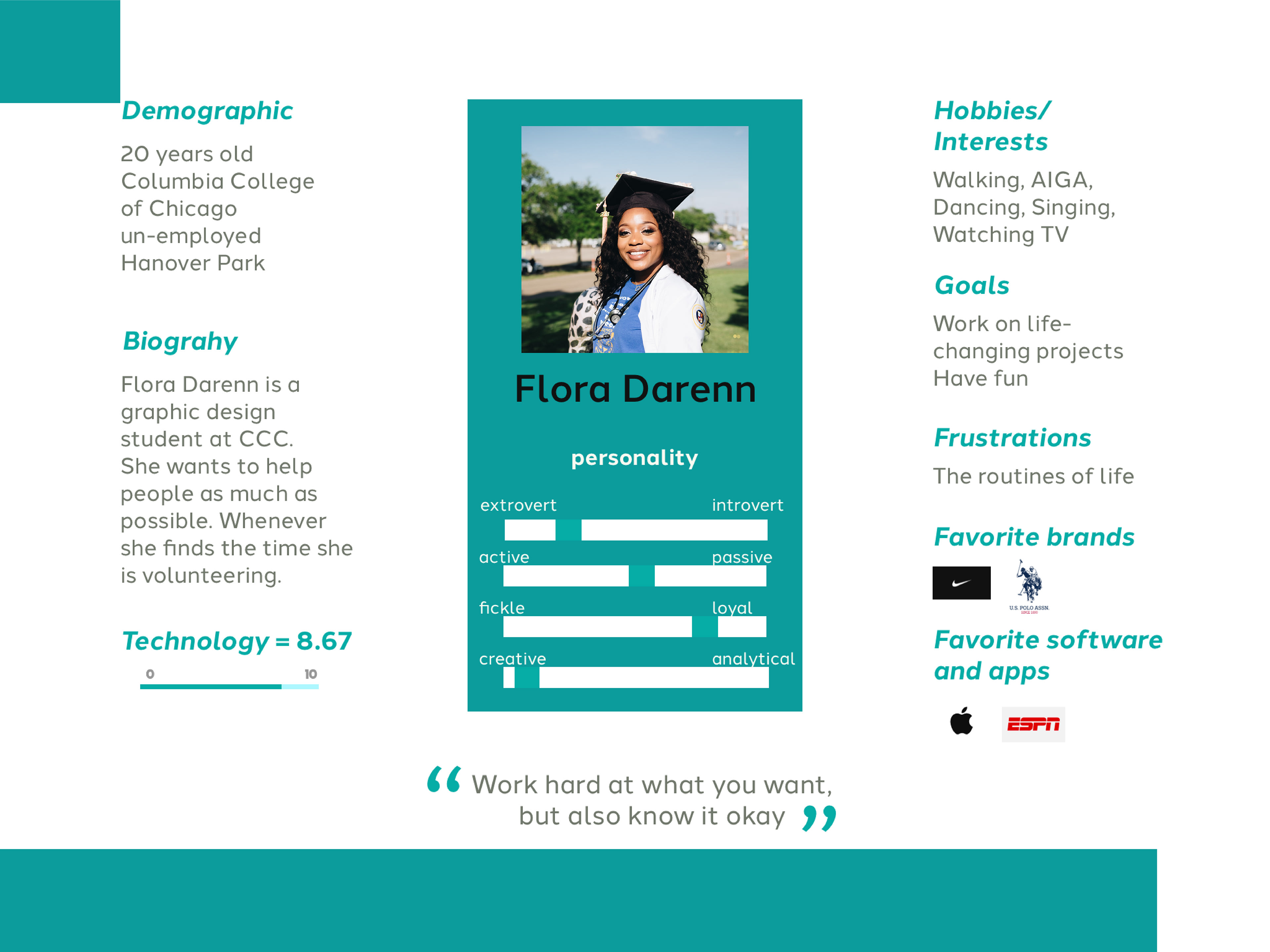
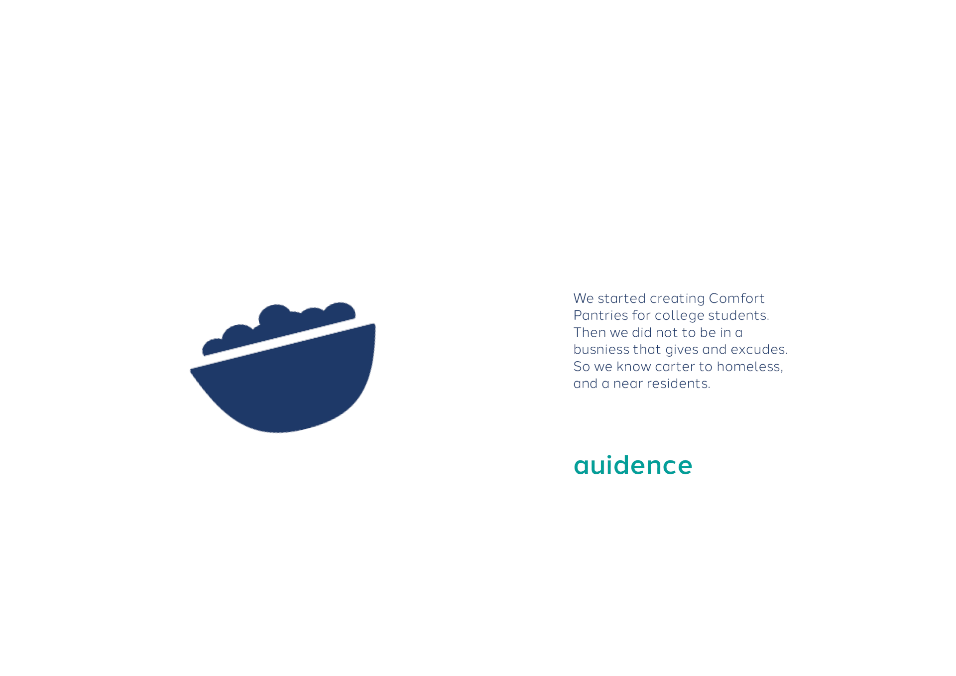
Audience
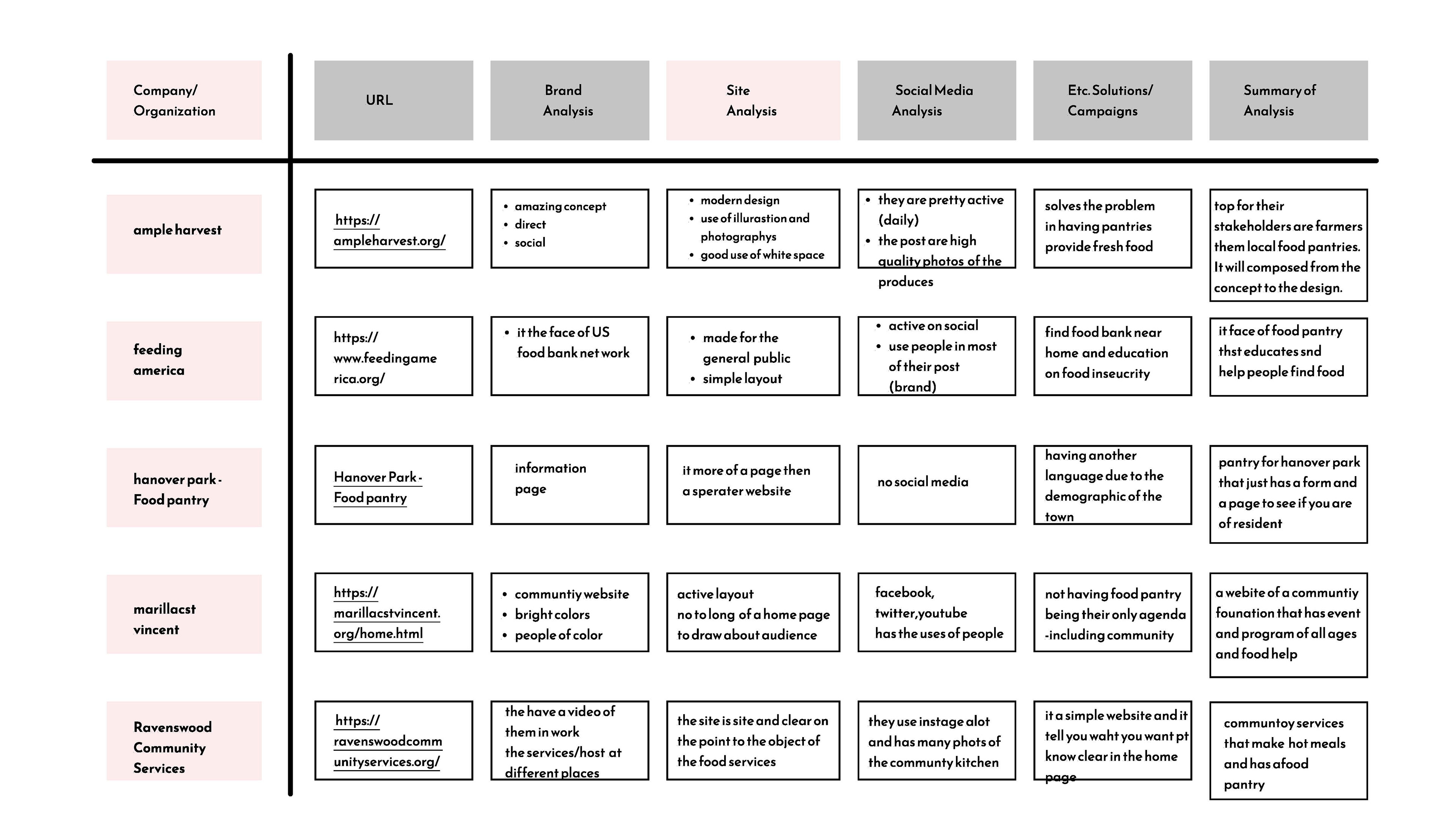
Competitor analysis
user experience and research
I researched similar theme that followed my topic of humanitarian services and was able to see how they advertise and visually organized their businesses. As well as, potential demographic who are looking for volunteering options.

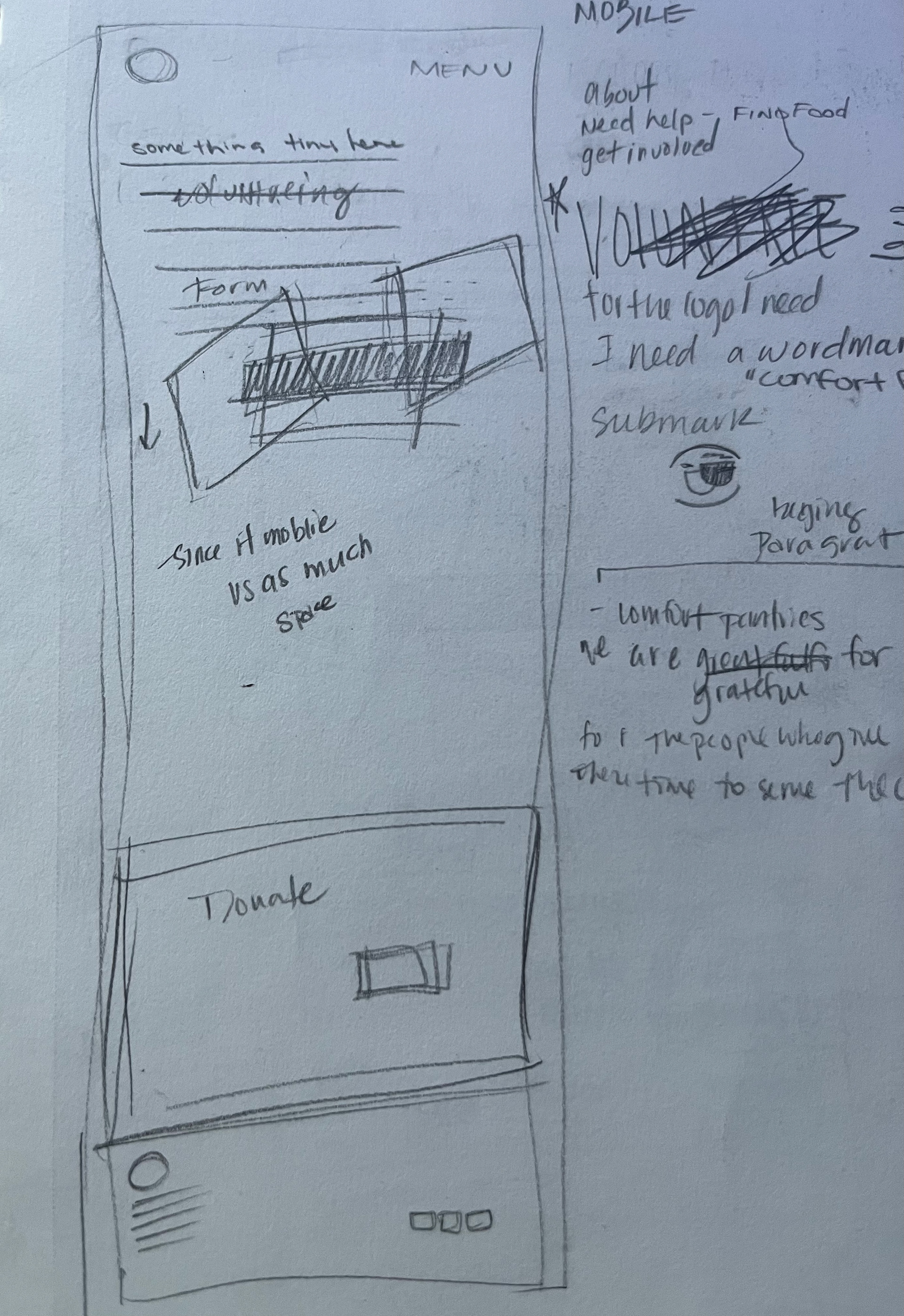
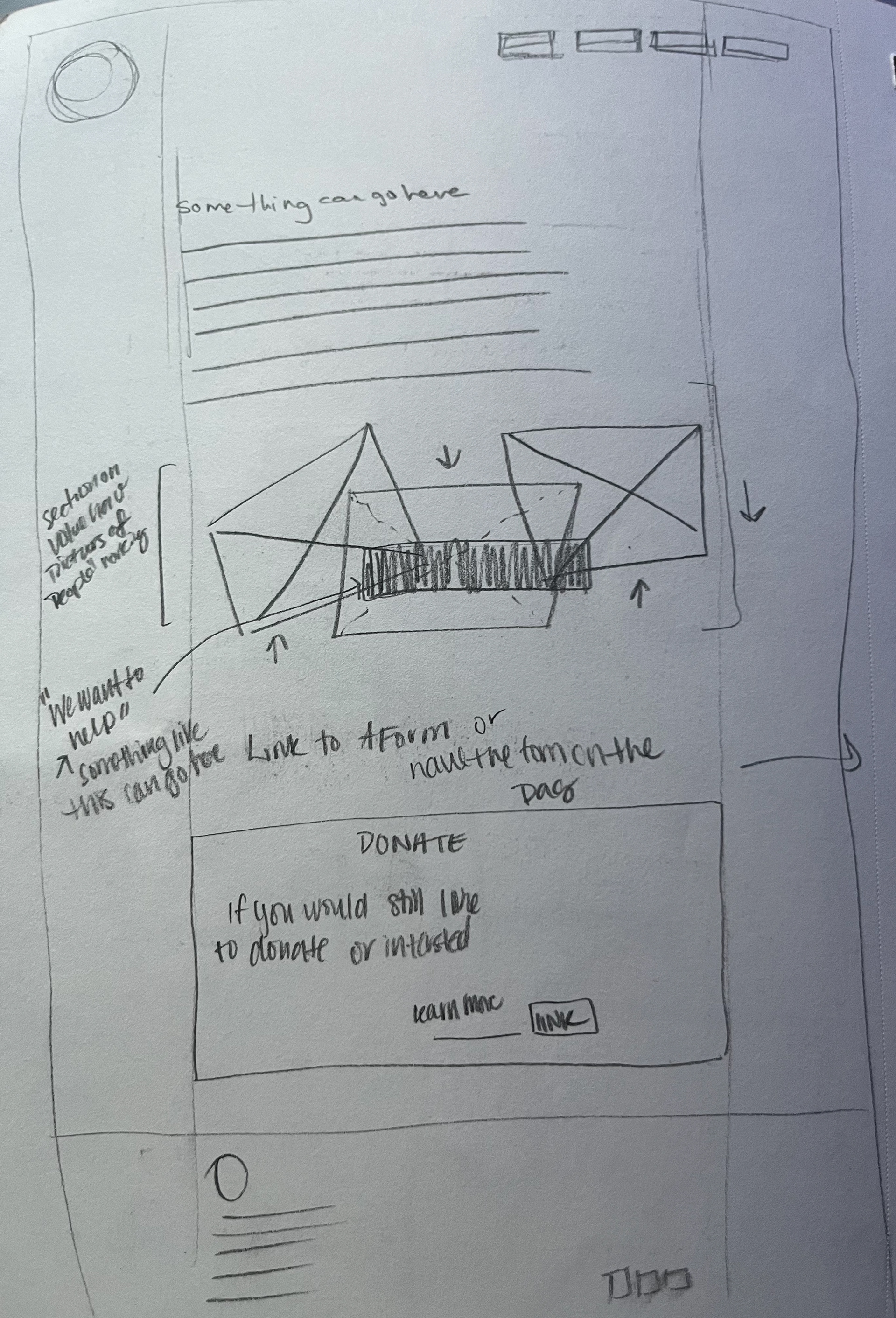
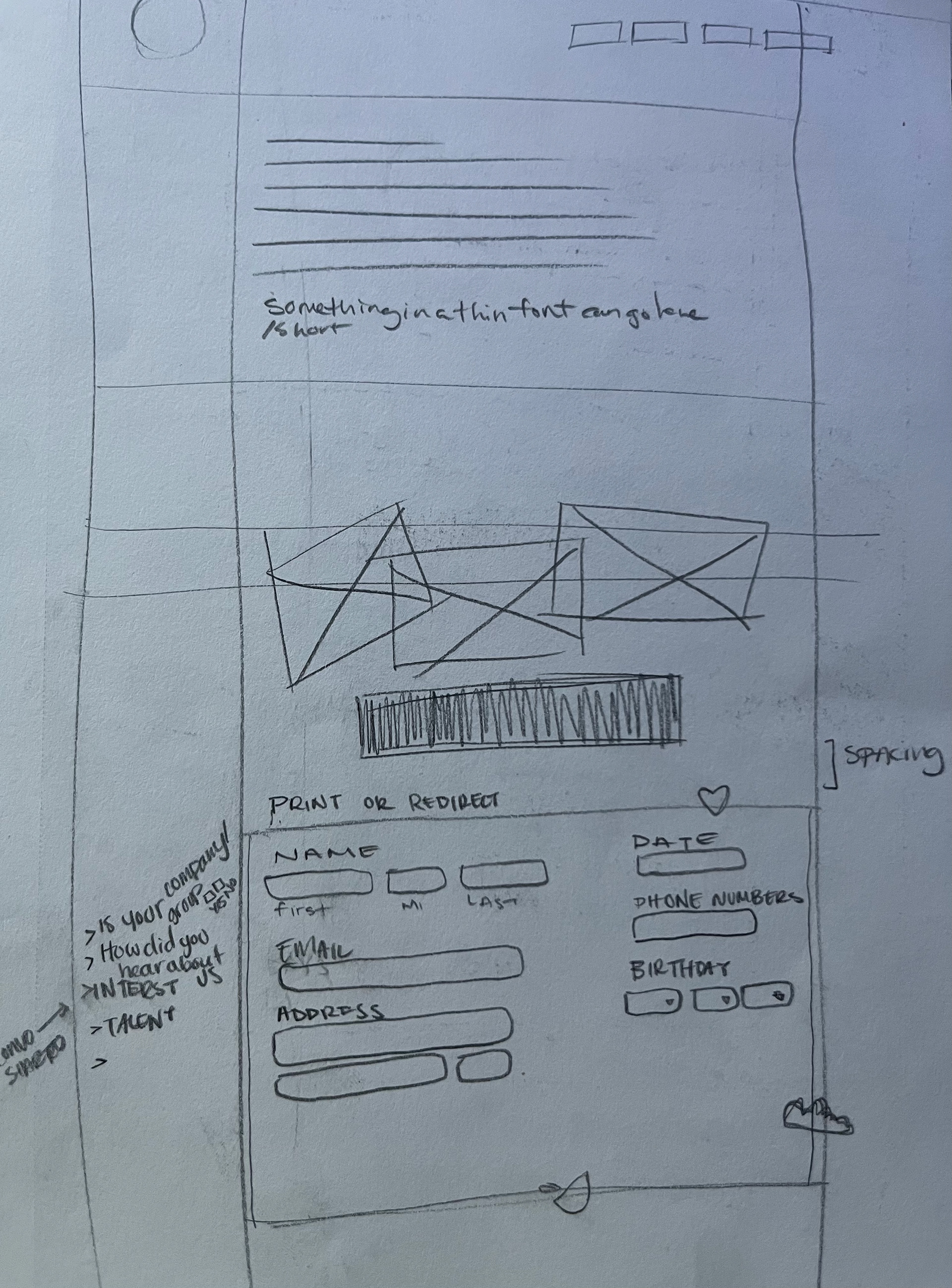
When drawing up the wireframes, I had to also consider how responsive the designs will be on mobile devices as well as different monitors.
Thought the process, I planned on these pages: home page, find food, volunteer page, and about page.
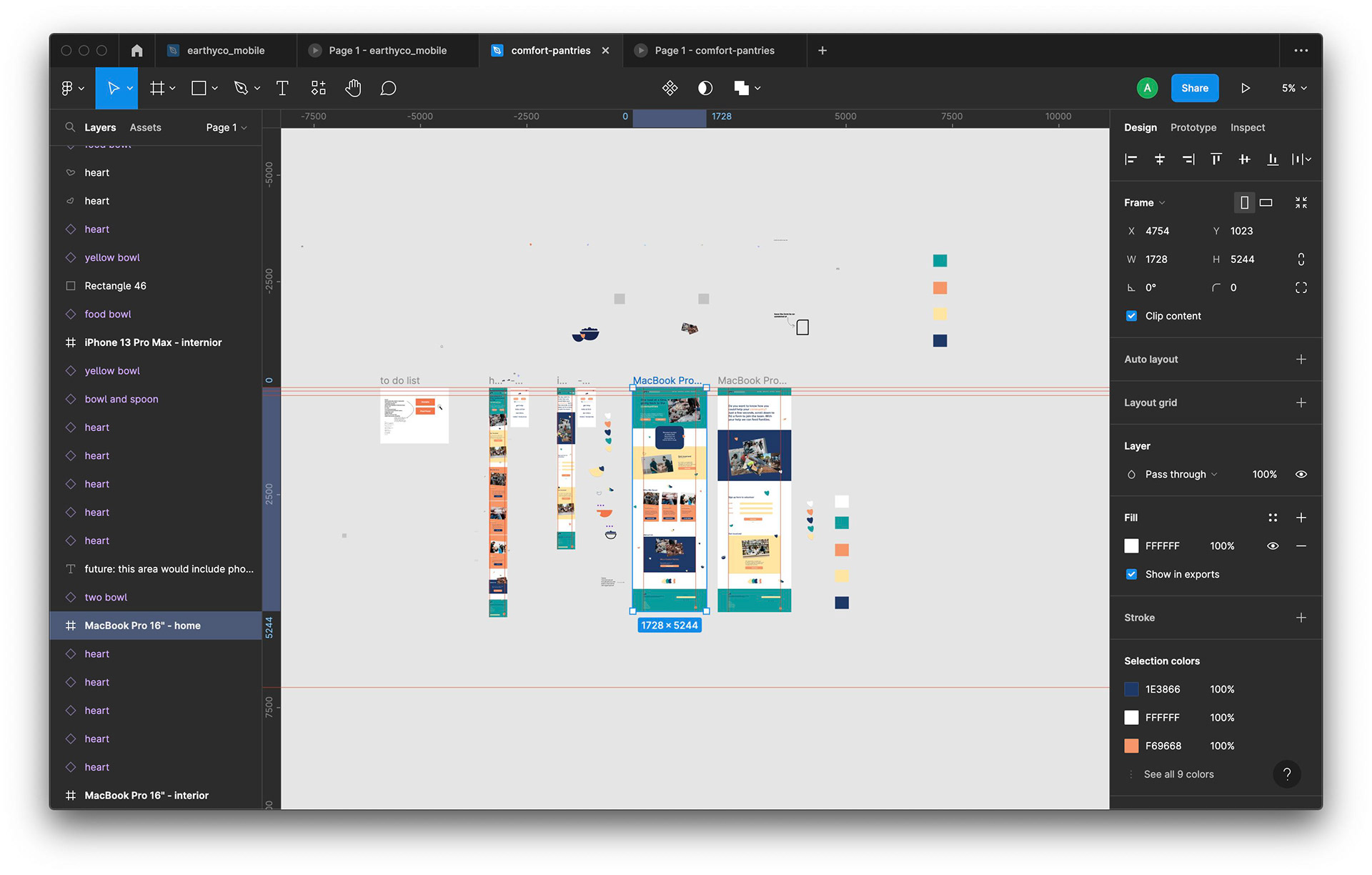
Design the site

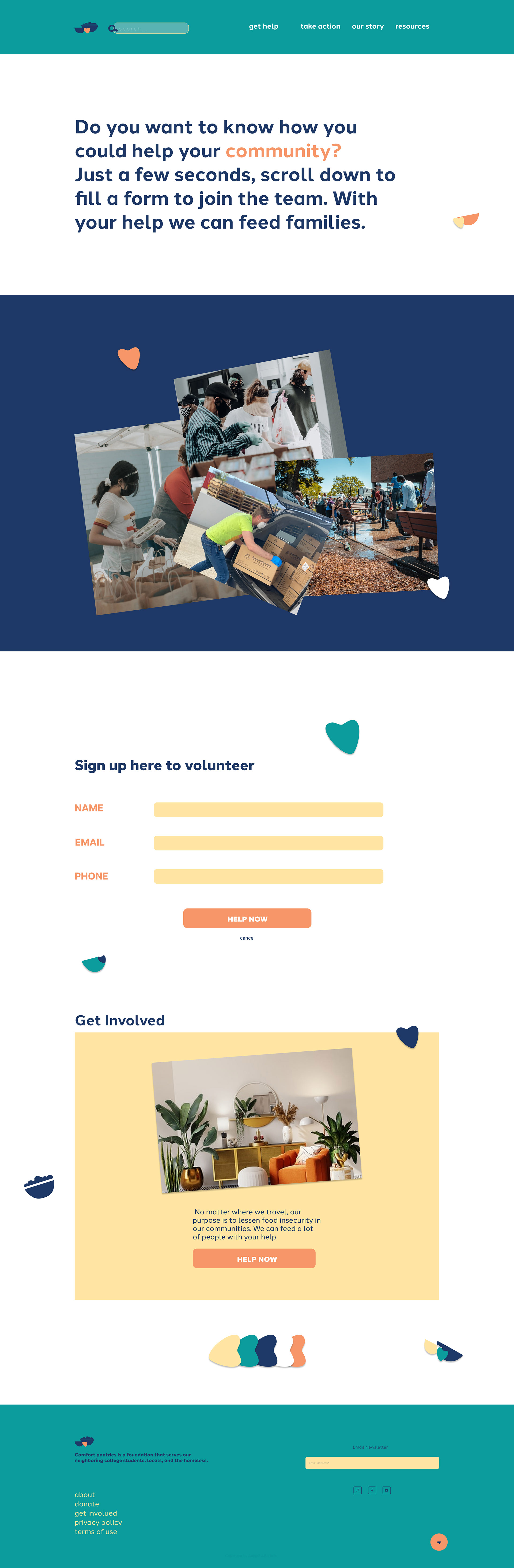
Volunteer page
brand guidelines
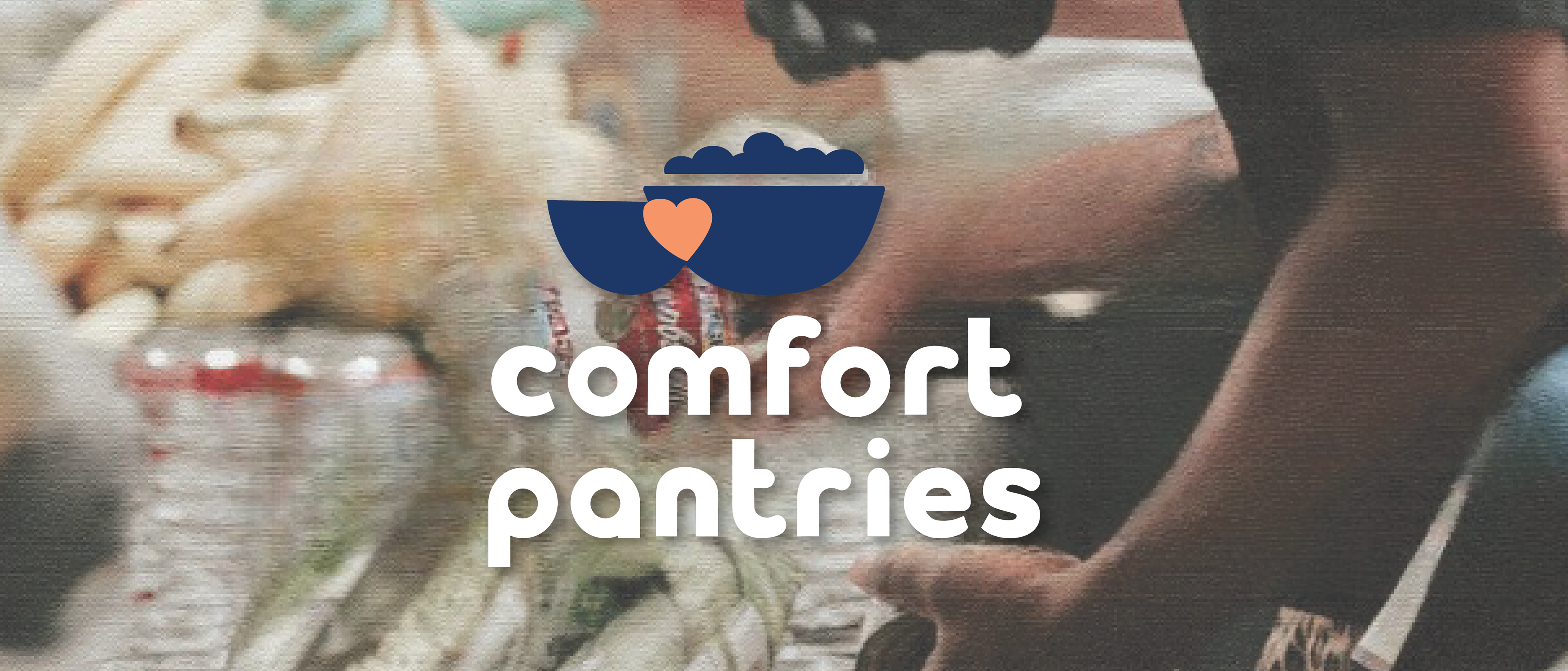
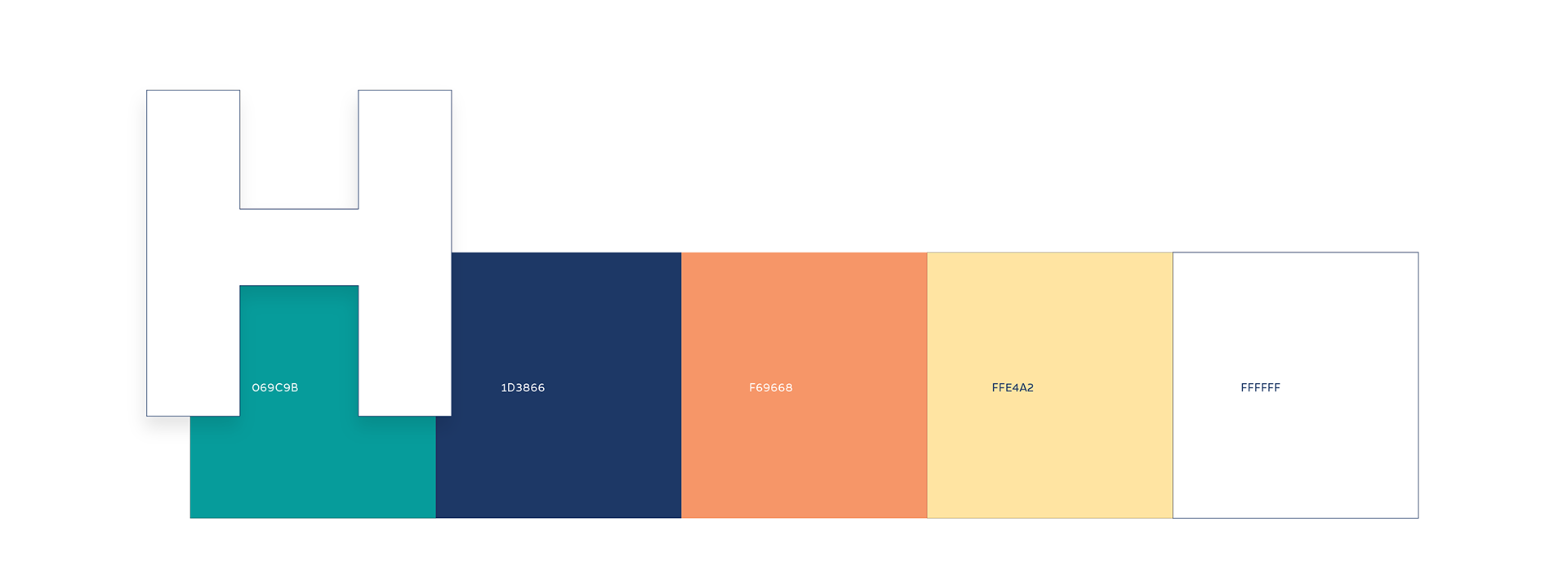
Color and typography
In this project color was very important. I wanted to research what colors invoke the emotions of comfort, warmth as well as security.
The typeface, HALCOM was use because of its thick symmetric strokes which was used to represent balance, good foundation and vibes. The type is the primary and only type used across the website and branding.